2103 Stalled.
Patreon
Subscribestar
Comic Vote
Reddit
Wiki
Holiday list
Something has changed the dashboard of the website, which is very worrying. It’s not something I did as far as I can tell, but the navigation is odd now. It’s another stick on the pile of “this site is going to crash hard someday & you’ll have a bad day that day”.


17 Comments
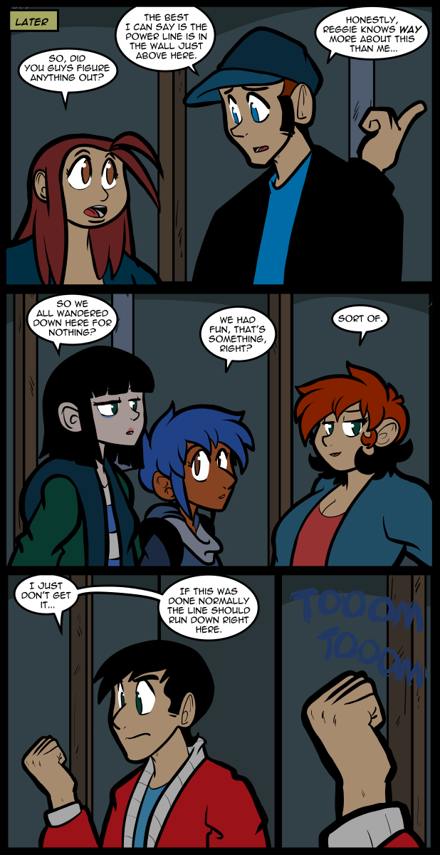
Is that a hollow thud Reggie’s getting behind that wall?
Dead body’s in the wall. The new floor is where they hid the drywall tools.
I hope you are backing this all up multiple ways.
How much storage does this site take? And where is it physically? In the cloud? At home? Both?
I’m really enjoying this storyline!
And I’m glad Reggie has been tolerable, and tolerated. I am hoping he will be rehabilitated and become one of the gang someday. (He might still have rough edges even as one of the gang; let’s not hope for miracles.)
He’s actually got something real to think about and the free brain-cycles don’t get spun off into sarcasm.
Like your comment, seconded!
I don’t quite remember what it looks like but I skimmed the inspector and it might be related to your lists under menu.
The first list has no class like the other but it also has this weird:
HOME
This should probably just be
HOME
Doing this fixes the weird offset in the menu bar. Again I don’t know what it’s supposed to look like or what the code is supposed to look like but might help point you in the right direction.
“come in”
Now how do we get into whatever’s making that hollow noise when we hit the wall?
Your home button is in a list with a second link to the home page that has no visible content but 8 pixels of vertical padding. If you delete it everything centers properly.
The first of the two links is the one that should be deleted. The second of the two is the one that should be there. My bad, sleepy brain. Hope that helps.
Now that I’ve seen it, it really bothers me. If you can’t fix it from why description of what the problem is feel free to post a discord link so I can DM you about fixing it if you want.
Or fully awake the best I can describe the location of the problem is in your html follow the path of body > (3rd) div id=”page” > header id=header > nav > div class =”menu” > ul > (the first li, before the page item li). Here there are 2 a hrefs, the second one says “Home”, the other one looks just like it but doesn’t say home.
Delete the one that doesn’t say home, even though it doesn’t have content it has the same padding that all the other list items have so existing above the actual link to home is a invisible link to home that consists only of padding and it’s stretching your entire nav bar vertically. When you delete it it will not only fix the extra dead space above home but also stop stretching the nav bar vertically and effectively remove the extra dead space below everything else.
I wonder if this trip, for a humorous experience…namely a hunt for fakey and spooky ghost videos, will turn into a REALLY spooky experience, such as- finding a REAL dead body. Hm.
I know, I know! I’m on the edge of shouting at the real people in my real room, in my real world, a’cause this is bugging me since the second power line was found by Reggie. I wanna know! Dunno what it is gonna be, but, I still wanna know.
That said, since dead bodies smell so awful that three feet of dirt isn’t enough,… Ever wonder why it is called “6 feet under” and not three and a half, or four?
What do YOU think might be there, if, as I think, as might be likely — it is Not: dead folks. I had four ideas, only two of them require level flooring.
Thought for the day; I have made many speculations about the twists in this webcomic– not ONE has been correct. I have often been right about what Jackie’s characters Won’t do. What they do seems so mundane in hindsight, but it always catches me off guard.
Jackie, thank you for another year of tender hearts, hard nosed business, strong sweet women that I can have the hots for, handsome guys doing right by the women En Universe, and adventures that I can never anticipate. Wishing you health and wealth and happiness in the new year.
Gene C.
Bodies are buried deep to prevent dogs, wolves and such from digging them up. One of my dogs would dig a 3 foot deep hole just because he was bored, never mind if he thought their was a bone or something in it for him.
Also concrete is a lot different than dirt and you wouldn’t need 6 feet of it to lock a smell in as it’s non-permeable. Still without either completely destroying the original floor and digging a hole you’re not hiding a body with a layer of cement without the first clue being why is the floor so damn high in this room.