Patreon
Subscribestar
Comic Vote
Reddit
Wiki
Presents List
Shirts & such.
Ko-Fi.
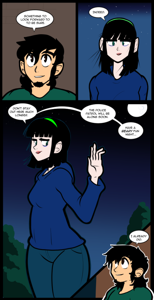
John is one of my oldest characters. Not as old as Ed, but still much older than most of the other cast members. He came into being in the mid 90s. At one point I was trying to draw a comic about a Ranma 1/2 style battle high school, but in the US. He was one of the characters designed for that. One of the only things that carried over from then to now has never really come up in Between Failures. John is exceptional at math. He and Carol have that in common. He could have been an accountant if it had ever occurred to him to try. He is actually better at doing math in his head than Carol. Somewhere near the same level as Jessica. I never write situations where it comes up because I am not good at math, so it’s hard to write it convincingly if you have to show your work. It is difficult to write characters that are better than you at things because it’s easy to get in over your head if you aren’t careful. The closer your world is to reality the bigger the danger. You can had wave away Bulma being able to build a time machine because the science in Dragon Ball is functionally magic. You never expect her to explain anything because it’s not important. You don’t need to ground it in reality the way you sometimes do when it comes to something that has more realistic world rules. I don’t expect his math prowess will ever come up in any meaningful way, but I have it in my mind when I write for him. Ironically many characters tend to treat him as a little simple and, in their defense, he presents himself that way much of the time. He’s not particularly well read, or studious, and not very intellectually curious. It’s not that he’s not smart it’s that he’s ignorant, and not concerned about it. A lot of things that people act like are extremely important in school have almost no bearing on your life after school. Unless you go into a field where trigonometry is important it is functionally useless knowledge. I’m not saying it’s bad to expose children to it, I’m just saying that we have deviated so far from giving kids a grounding in everyday life skills that it’s become a problem. At no point in his life did anyone notice that John was gifted in any way, so this natural talent lies dormant in him. It is somewhat tragic that he is often dismissed as just being a handsome lad when he has hidden depths. Additionally it’s not like the people who underestimate him do it out of malice. Alex described him as a beautiful idiot because that’s what he seems to be. In many ways that’s what he thinks he is, but he’s not deficient. If something moved him to pursue some complex subject it would no be above him. If he proved to be Alex’s intellectual equal, or better, she wouldn’t hold it against him. No one would be happier than her that he found something to excel at. That goes for Victoria, Thomas, and most of the rest of the cast who have underestimated him at every turn. Although I will say that Thomas suspects that he’s far more capable than he realizes, Thomas just can’t halt his life to try and find the special magic in John. In any case every dog will have his day and so too will John. I hope you will be here when that day comes.
I have nothing else of importance to convey. Arguably I didn’t have anything of important to convey thus far either, but since you’re reading this it’s likely you’d at least find the extra information entertaining in some way. I am capable of at least accepting that if you are invested enough to read the blog that you aren’t here against your will and you enjoy some aspect of this little dance we do here. I will return on Friday with what will probably be the conclusion of this arc. I’ll have to take a glance over the last several months of loose ends, but I think I’m ready to move on. This next section is going to be quite a tale, but it’s something I’ve wanted to do for a very long time and one of the last bits of original script I’ve never gotten around to doing. I’m going to try and keep the pace a little more brisk and traditional in terms of conventional storytelling, but I’m also not going to cut myself short if I want to explore something. I hope I have another couple of decades in me so I can tell this entire thing the way I want. I guess we’ll see. Hopefully most of you will be along for the ride, and maybe we can pick up a few more on the way. In any case, the support links are in the same places as always, I will see you on Friday. Until then, count twice your blessings.

