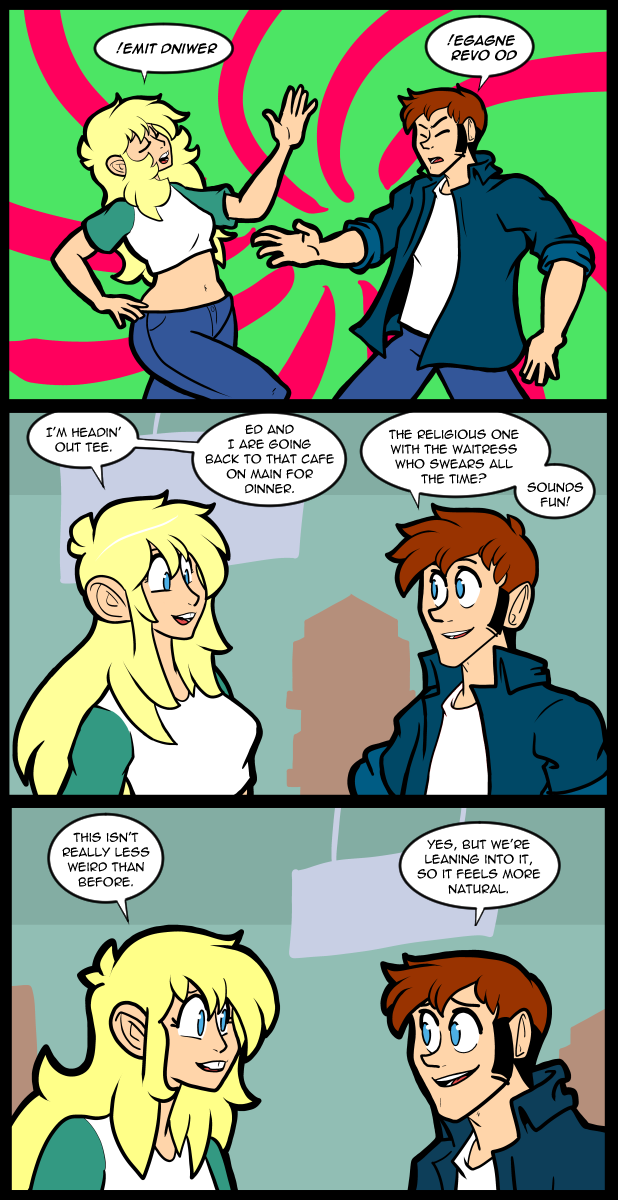
2532 Back In Time!
Patreon
Subscribestar
Comic Vote
Reddit
Wiki
Presents List
I got a little off track tonight so I’ll keep it brief.
To who ever anonymously sent me that giant ass Lego set, thank you very much. You were wise to hide your identity to stop me from trying to reciprocate… Clever girl…
I’m off to the dentist today, so that’ll be… Fun?
If you want to help me pay to have my teeth looked at please use the links above. XD
Until next time, stay frosty.


30 Comments
I always love these two interacting. Or just Nina with anyone really. As always
.rorrim a ni ti ta kool ot dah ekoj emit dniwer eht evol
!taht ekil gniklat pots esaelP !WO
(Hee, hee, hee!) :D
(This one probably reads better, in your mirror):
!???? ??il ?ni?l?? qo?? ????l? !wo
Nope. This site didn’t like those characters.
(My luck is golden as always. Faw.) :)
A friend of mine, long ago, argued for mirror images and rotations to be included as diacritical marks in Unicode, but thd proposal was ridiculed and ignored. A pity. You could have used that. And mathematicians often turn operators upside down to indicate a different, but related operator.
That’s cool to know.
Thanks. :D
He told me it was a formal proposal to the relevant committee.
Bwa HA HA! :D
.yako txet nwod-edispu dna drawkcab daer nac I
D: !werbeH ot detluafed saw gnittamrof eht erehw tpircsunam a gnitideypoc yrT
I had trouble with trying to read your “tpircsunam” phonetically. I hope nobody ever makes me say what I read, out loud. It’d be pretty embarrassing.
It helps to read a lot of Zatanna comics.
Yeah, I grew up with a crush on Zatanna, I’ve been finding a surprising amount of use for that particular skill the last few weeks.
I didn’t have trouble with tpircsunam but gnitideypoc was confusing since I’m not used to that particular compound word, so I had a brain disconnect going from the y to the e, lol.
Good luck with your visit, Jackie. :D
I spent way too much time figuring that out.
Saving that for next time I find myself in an awkward conversation. Don’t take long lol
Not sure why, but I love this page!
Is it just me, or is Nina putting on a little weight? Not that that’s a bad thing, she just is looking a little “hippy” compared to the fan-service Patreon link pic… :)
…And the psychedelic spiral, in today’s background, helps her “hippies” look as well! :D
It’s an effect of the pose she’s doing, I think, coupled with her manner of dress. In the patreon link pic she’s facing more or less straight on with her legs pressed together, hunched forward, and is using a baggy shirt to remain barely decent, that hides a lot of her curves, both in posture/pose and clothing.
In panel 1, on the other hand, it’s a side view, with her forward facing leg bent upward, highlighting the curvature of her buttock, while her other leg is straight, this causes the hips to seem broader than they usually would, this effect is enhanced by low-rise jeans which also do a lot of work to highlight the curve of the hip.
Things like pose and camera angle can do a LOT of work to alter the apparent proportions of a woman’s body (I imagine probably on a man’s body as well, but admittedly I don’t pay as much attention to those so examples of this don’t spring to mind), this sort of visual trickery is often used in before and after pics to cause weight loss to appear much more dramatic in ads for fitness products (a lot of the time there isn’t even a real difference, the pics might even be taken 20 minutes apart, just change to more flattering clothes and change the pose to highlight different features and the same woman can appear tens of pounds lighter).
I’ve been reading this comic for 16 friggin’ years and never knew Nina and Thomas could do magic.
Holy Carp, really? Nobody’s gonna make the joke? So it’s gonna have to be me? Well OK then, here it goes!
“LET’S DO THE TIME WARP AGAIN!”
Pretty sure I’ve said this more often than necessary, but your webcomic is my absolute favorite of all time, Jack! Looking forward to more of your shenanigans!
“Come AGAIN?”
“…And so does BRAD!”
;D
I assure you, the magic is only in their heads.
Time for a Sabrina spin off.
How about a spin-off of “The Rocky Horror Picture Show”, instead?
Here’s some info on the, TRHP Show spin-off, “Shock Treatment”:
https://en.wikipedia.org/wiki/Shock_Treatment
Clever writing lol XD I like that they’re playing up the tension. It’s cute
hahahahaha absolutely batsh!t in the best way possible
I like the way you did backgrounds in panels 2 and 3.