2991 Do It For Her.
Patreon
Subscribestar
Comic Vote
Reddit
Wiki
Presents List
Shirts & such.
Ko-Fi.
I fiddled with this page trying to get Thomas’s eyes correct for so long I have limited time to blog before it’s supposed to go live. It’s not like I have anything much of import to say, but I don’t like being under the gun. A lot of artists never think about what a character will look like straight on. Even pros who have been in animation for decades completely ignore it when designing characters sometimes. I’ve struggles for years to figure out what the best way is to depict my characters when facing forward and I’m rarely truly pleased with he results. In this case I at least got his eyes to sit on his face in a way that doesn’t make my brain instantly shout WRONG at me. It waits for a minute to consider things. Sometimes all you can do is your best and hope for a better result later. That’s essentially been my entire life at this point. I’m beginning to run out of later though…
In any event I hope this Wednesday finds you happy and alive. I will return on Friday with more comic. Until then, feel the dirt between your toes.
21 Comments
Steven Universe reference!!!
I certainly didn’t intend to make one, so I don’t know what it would be. My apologies if that disappoints you.
?you do it for her?
Aka a song Pearl sings.
I’m afraid that is also a reference to The Simpsons. XD
Please, let’s [not] make a Steven Universe, + The Simpsons, crossover.
…I think if we DID, Homer’s bad attitude would get him [bashed] by Pearl + her friends!
:D
I was stuck at a crossroads thinking of both.
To add a datapoint to an unofficial reader demographic survey I only knew the Simpsons one, so guess that can narrow in my age range haha.
I knew both, but knowing the humor and such i assumed simpsons
The face thing is why I decided to write instead of draw. You have to gt it close enough each time.
I prefer writing anyway, especially in cursive. Then I copy it to a computer for editing.
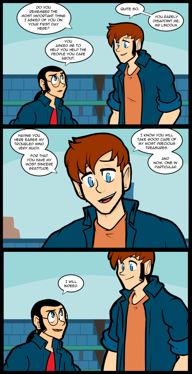
This is so sweet. Thomas just telling him how much he trusts him, especially with his best friend. It’s like the scene you see sometimes in media when an in-law tells a partner that they think they’re good for the person they have in common.
Thomas looks great straight on!
For what it’s worth, I think the head-on perspective is good; as for the comic this is nice, and even if it sets up revealing some darker moments in the past it’s almost a reverse palate cleanser – even if things get dark, in the present we are good.
Hello! I’ve been reading this webcomic along others I started up senior year (’08) and I have to finally come out the woodworks to say – your art style has come a long way and has gotten better each time. I couldn’t see you capturing Thomas’s expression like this a few years back. This is stellar, my heart warmed when I saw his eyes. The characters are all relatable in their own ways and that’s what helps this webcomic feel exciting to read when it updates. To see how much they’ve grown now since the beginning – thank you for this journey, and may it continue on ’til your story has reached its destination.
Your comment made me go back and look at the early strips, and it really hits a whole lot different then than now . . . .
. . . but I noticed an interesting thing. In #16 . . . Carol derisively refers to Ed as “Harry Potter” for his look . . . and Nena comments, “I want to ride him like his quidditch broom.”
This whole thing has literally been brewing since the start of the (story) universe.
Yeah, Nina’s been interested in him from the get go. I think the door that Thomas “kicked open” was Ed thinking he couldn’t succeed on his own (with Nina or otherwise).
Thomas’s straight-on look, looks fine to me!
:D
*thumbs up*
Glad to know you’re enjoying it.
“Even pros who have been in animation for decades completely ignore it when designing characters sometimes.”
I know you meant it as highly distinguished artists who have honed their craft to peak human levels (and those in traditional animation are particularly good at closely matching previous frames for consistency). But still, give yourself some credit. By the very definition, you yourself are a pro artist. You’re using art to support yourself. Your style (like many comic artists) is less formal than traditional art, but you’ve managed a consistent style with instantly recognizable characters while still improving the art over time.
The dilemma with symmetry versus asymmetry for head-on views of characters is something literally every artist I’ve known has struggled with, and many of them prefer to leave the final results mismatched since even real world eyes look oddly mismatched (see photos people hate of themselves). Thomas definitely looks natural here, so you outperformed many people’s accomplishments.
In a wider sense, your artistry has been pretty impressive beyond the visuals. The dialogue and relationships in the comic have been satisfying, and you’re pulling off the “asshole who may not be as bad as first impressions” with Reggie extremely well. I know from reading the comic and your comments for almost two decades that we have some differing opinions on aesthetics, but I’m still here and don’t plan on ditching anytime soon.
Anyway, back to lurking. Just wanted to toss something positive your way.
I appreciate the input.
Went back to the beginning and reread until I got to the point Thomas and Ed refer to
forgot how consistently funny you are, man
and some of the pages in the backlog the jokes stack /fast/
If you read the comic at the pace it’s meant to be performed the jokes move along briskly, but a lot of the humor is more dry wit than actual jokes in a traditional sense. To me it seems very natural though because both sides of my family are extremely quick witted so the humorous observations come at you pretty fast.