2900 Taste Is What Counts.
Patreon
Subscribestar
Comic Vote
Reddit
Wiki
Presents List
Shirts & such.
Ko-Fi.
Well, first of all, since I know you’re all worried, I did not find my missing toy. I made it through twenty or so various containers, but it wasn’t in any of them. I know this isn’t the news you wanted to hear, but there it is. I haven’t given up hope but things are bleak.
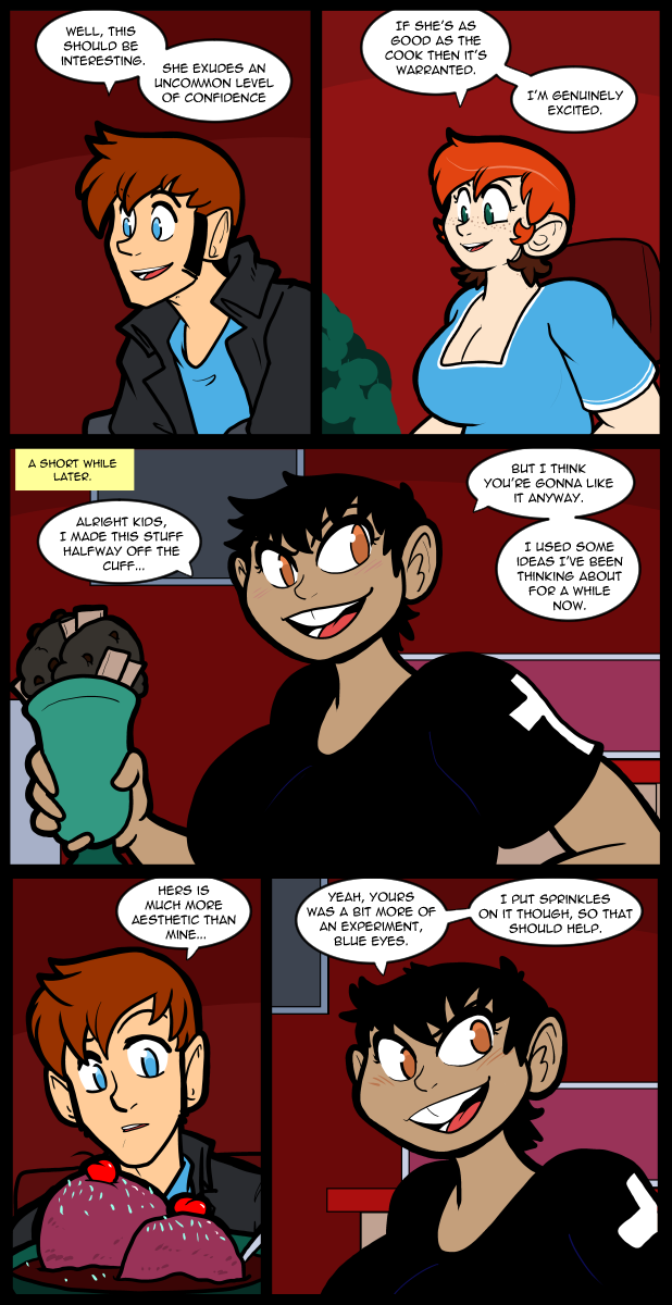
Drawing food is not a strong point for me. There aren’t a lot of artistic strong points for me to draw on in general, but that one is pertinent here. Thomas’s one is supposed to look a little jank, but I think it actually looks kind of delicious. Carol’s is supposed to look impressive and it isn’t all that much better looking than the other one. I’m basically relying on the text to convey the idea that in world these things look how they are described. Not a great move for a visual medium, but it is what it is. It’s kind of like how Nina is described as exceptionally attractive, but I don’t really do anything in particular to set her apart from any other character. In my head she’s just just exceptionally pretty and how other characters react to her is really doing most of the heavy lifting. Also the things I think are attractive don’t always translate to that for other people. I think Evrina’s little rat face is fucking adorable and if I knew her IRL I would be really sad that she likes girls. She’s got them teefs that are perfect for nibblin’. If I had established my art style a bit more before I designed the main cast, and not been so worried about internet scolds at the time, Carol would probably have quirky teeth too, but she was meant to be the romantic lead, so she, like Thomas, are more generic that I might have gone with if I had been a little more experienced.
I have a pretty well established catalog of features that I just mix around to make new characters. Evrina has an abnormally wide head, and eyes I very rarely use, because they are harder to navigate at uncommon angles. I like trying to, but the results get a little questionable sometimes, with with my art is saying something. I went a bit more unique with most of the furries because they weren’t going to be a massive part of the story and they were meant more for expressing myself outside of the comic. I just really enjoyed them and wanted to keep bringing them back. Bridgette suffers a lot because I didn’t really work out her design very well. Her face hasn’t really settled into a version I feel like is “correct” yet. Ramon has started to settle into a version of himself that feels right after a long time of basically being able to draw him only one way with one expression. This is what comes of doing all this stuff on the fly and hoping for the best. Past the first two arcs in particular Between Failures is basically just a rough draft that got out of hand. I feel like it’s pretty good for being a first try though. I don’t know many people who could make their first swing look as intentional as I do.
Anyway, I hope you are greeted by a pleasant Monday and we can meet happily on Wednesday again. Until then, stay pure & natural.
18 Comments
Yes ice cream. The other thing that makes everything better besides pizza.
Good choices. :)
I like pies + root beer, too.
The ice creams look fine to me!
:D
I’m gonna hang around to see what type of dessert was given to Carol. I’m curious about that.
That second “experiment”‘s design delivers a strong “everyone likes boobs, right?” impression.
That might also be internet brainrot taking over the pattern recognition duties, though.
I drew two scoops of ice cream on the fly, trying to make them look nice, but a little sad, and never once thought of fat tits. So many people have suggested that the ice cream does, in fact, look like big, round, boobs that now I’m wondering if I didn’t subconsciously draw it to look like a set of magnificent breasts. I added the cherries to give it a little color and imply the flavor of the ice cream, not to depict a pair of tumescent nipples, and yet…
If this went to court I think I would get convicted on circumstantial evidence.
The court finds you guilty.
Of making us confirm that we’re the real dirty minded folks.
Yep. The jury returned their verdict in one minute.
Yup
Bewbs
Or, one idea is: if [drawing two scoops of ice cream…maybe equals a 2-boobs image], then an option is to draw- [3 scoops, as a standard, ice cream picture], and that would remove the problem- by making it a “3 boobs image”, instead of a “two boobs image”.
Hm.
I think it’s the cherries on top that represent the nipples that really threw us over the edge, we dirty-minded internet folk. Plus there’s the fact that they’re unevenly sized, which any woman will tell you that whether a little or a lot, they’re not the same size… unless a plastic surgeon got involved. Pretty sure all of the ladies in the webcomic would be natural that have MOUS (mammaries of unusual size), unless they needed a reduction due to extreme back pain.
Thus, in our dirty minds, that leads to the meme of Morgan Freeman saying Titty Sprinkles.
Who is this “Ice” woman? And [why] are people asking her to…
On Carol and Thomas being the romantic leads.
I suddenly have this idea in my head of a scene, set twenty-some years later, after Thomas has finally started acting on his potential, and he and Carol are long married. We see there kids looking at a large group picture of the whole cast, and realizing:
“OMG! Our parents were the romantic leads!”
Oh no…she’s got JIMMIES! ALL I CAN SEE IS A HORRIBLE RAINBOW!!
“A Horrible Rainbow”.
Isn’t that a TV show, starring Levar Burton?
:D
In the Steven Brust books there is an idea of a restaurant where you arrive about noon and leave about midnight. I think it’s called “Valdemar’s”. Going there is about the whole experience. I’ve never been to a restaurant where the chef made something just to impress me but I hope to before I die.
I enjoy the title so much. Taste is What Counts when someone like me is a good baker and cook, and doesn’t really do anything in the way of “presentation” or “plating”.
The chef in training in the discord thought the presentation was good. I guess I just can’t hide my excellence.
Very aesthetic indeed. It reminds me of…. the San Onofre Nuclear Power Station.