2830 Tabletopped.
Patreon
Subscribestar
Comic Vote
Reddit
Wiki
Presents List
Shirts & such.
Ko-Fi.
It’s amusing as a creator to bring up deep issues of the nature of the human experience that get zero interaction, then turn around and have a character potentially misidentify a color and everyone has an opinion. That might say more about the human condition than anything I’ve ever written. XD
The color of the shirts is mostly blue with a little green. I’ve always thought of it as a shade of blue green in my head, but it really doesn’t matter that much. I don’t know who is the final arbiter of what a color is or isn’t. I always got my color names from Crayola and what is called Blue seems a lot closer to purple to me, but on a spectrum it’s right in the middle between the other colors that aren’t blue, so it must be the bluest blue of all.
Play-Doh used to sell Crayola blue as the standard blue in packs of 4, but now they sell something more akin to what people would probably call sky blue instead. They still make the bluest blue, but switched to selling more of this sky blue for whatever reason. Their red and yellow colors are basically unchanged from what I remember them being my whole life. What they call red I actually see as more of an orange red rather than what I think of as true red. Reggie’s jacket is what I think of as RED. The color they use for yellow always seemed a little dark compared to what I think of a yellow. Not by a lot, but enough that my instinct is to want to add a little white to it to make a brighter yellow. Hex codes are probably the best way to identify colors if it’s actually for something important. Leaving it to the imprecise nature of language is probably unwise. The color of the shirts in hex is 004886 I think… No, wait, it’s 004866. Much more blue than green, but not technically wrong to be called green on some level.
When I chose the color of the uniforms I wanted something that I could stand looking at that was also not any company’s colors that I knew of. I landed someplace between the forest green of Hastings and the blue of Walmart. I like the color I chose and I made sure when I did that it looked nice with Carol and Nina’s hair. Carol in particular has a shade of red to her hair that clashes with a lot of other colors. I try to dress her in colors that don’t clash with it. And this isn’t some scientific thing, it’s just what looks good to my eye. on my screen. Matching color theory with me is mostly an accident just because there is a natural instinct about what colors look right with each other. I have a very basic understanding of color theory and I tend to pick very saturated colors because it helps me see things better. I can see subtle gradations of color. I’m not colorblind, but especially in low light conditions bright colors help me see much more. Otherwise my vision gets a bit muddy, which I don’t like. It’s gotten worse as I’ve aged and I’ve made an effort not to lean into it on accident.
On the subject of color, when I was little I liked Smurfs a lot. I mean, I still like Smurfs, but I was really a fan when I was a kid. Anyway the old Smurf toys used to be painted in a much darker blue than the shows actually depicted them. I don’t know why but they never matched the colors very well. Maybe in German media Smurfs were darker? I honestly can’t say. In any case the modern Smurf toys match the colors of the characters much better. I don’t know when the switch was made, or if it was gradual, because there were decades when they fell out of favor that you just never saw Smurfs figures anywhere. I assume they were still making them, but I’ve never researched it very thoroughly.
When the CGI movie came out they toys were a very light blue. Lighter than what I would even call sky blue. At least the toys made by companies other than Schliech. Their toys from that era were lighter than the vintage blue, but not as light as other movie toys. Although they did more or less match the uncanny visual style of the CGI Smurfs. I didn’t pay attention to any of this until much later.
Right now the sculpting style and coloring of the current Schliech figures matches the style of the CGI smurfs cartoon called The Lost Village, and the subsequent media. Netflix has the series connected to it available in the US right now. IMO it’s the best modern visual depiction of the franchise and a decent representation of the concept generally. A bit of the egregious girl power messaging has seeped into it, but that’s just they way of things right now. At some point humans will probably get to a point where we understand that it’s okay for women to just be feminine if that’s how they like being, and violent if that’s being true to themselves. We’re edging closer and closer to that bit by bit. But I digress. I actually like the addition of the village of female Smurfs. The characters are nice and it makes for a wider range of storytelling. It also recontextualizes Smurfette’s place in their culture as a manufactured being who was basically a girl raised as the lone female in a completely male centric culture. The show doesn’t go very deep with it, but there’s a bit of it in there and it makes Smurfette a sympathetic character as she becomes a sort of bridge between cultures while also not totally being completely part of either of them.
All of that aside, the toys are more or less the right shade of blue and I like that.
Anyway, I hope you have a nice weekend. Support links are in all the usual places. If all goes well I will see you on Monday. Until then, keep smurfin’ that Smurf.
31 Comments
Nice green shirts. Didn’t even phase me about corporate calling them green and so you wrote them as green. Gotta check the comment section more often.
Neither did I, mostly because I could see some green and so accepted the name without much thought. I can also see a situation where their design committee started with Green, noticed it was too close to a colour of an unrelated brand, and then they darkened & tweaked the colour until it was something that neither their Committees nor their Lawyers had a problem with.
This also reminds me of how “Lego has never produced a PINK brick”. Oh, they’ve made colours that the average person would call Pink, but their internal colour chart calls them things like ‘Light Magenta’ and other variants of Purple.
I’ll admit to thinking “What – but they’re blue, aren’t they?”. However, I’ve always been slightly colourblind, exactly when it comes to green and blue, so I thought it was just me. But I must admit I don’t see any green in them
For the “hint of green”, I see them as being a Teal, which is one of the many colour names for the colours between blue & green. The last page also literally pointed at the hex-code, and said it’s positioning is about 2/3rds blue and 1/3rd green (I’m over generalising here, instead of giving specifics).
“Maybe in German media Smurfs were darker?”
Well, Smurfs are French, but no, in the original comics they were very close to the light blue of the 1980’s animated series.
Yeah, but the company that made the most well known toys is German. I assume that all international printings would be more or less the same color regardless of language, but that isn’t set in stone.
It’s not so infrequent that some details like colours are altered during localization for another culture.
This got me curious, I checked around a bit, but I have zero answer.
Just one thought.
The Wikipedia page of Schliech make it seems like the cooperation with the Smurf licence was quite successful.
The author of the Smurfs most likely saw with his own eyes the toys, and either he decided that he was okay with it, or Schliech had a proper reason to go for that colour rather than the original one.
Just a heads up, it’s actually from Belgium (the French-speaking side of it), and Belgian people are generally not too happy about being mistaken for French.
As for the colours, I never really paid a close attention to it as a kid, but for me the comic books, animated series and various toys available in France seemed to have roughly the same colour.
Okay, but calling them “French” seems like an upgrade to calling them “Walloons.”
Well, I never met someone that introduced themselves as:
“Bonjour, je suis wallon”
They just say Belgian instead.
And they might not be wallon, roughly one quarter of the French speaking Belgians are living in Brussels which is not part of the Wallonie region.
And as a matter of fact, the author of the Smurfs was from Brussels.
It doesn’t help some batches of Crayola Crayons had slight variations in shade, and some of the colors changed a little over time, or more and faster if let in the sun.
The great thing about arguing about something like hues of clothing color is that it ultimately doesn’t matter in the grand scheme of things, so it is a “safe” argument to have and nitpick at length about.
Other parts of the human condition are not as such. Danger, Will Robinson! Danger!
I agree, I think that a lot of people either don’t have the energy to argue about the big topics or they’re smart enough to know it’s a waste of time.
Perhaps we would actually benefit from having more inconsequential topics to argue about, so we could practice our communication skills.
Pffft, this is the internet. No one would take that lesson seriously.
You don’t have to take a lesson seriously to learn from it.
Fun fact, in many other languages, there is no distinction between ‘blue’ and ‘green’ at all. In Japanese, both blue and green are called ‘blue’.
That’s funny. My Japanese teacher told me there was a difference between “Aoi” and “Midori”
If I remember correctly, “midori” only refers to a specific small range of shades of green, and other shades that most English-speakers would call green get lumped in with “ao”.
I can totally see that color being called Megatainment Green.
Cause it’s blue. -ish. blue-ish.
*sits back with a stopwatch, waiting for someone to drop the punchline…*
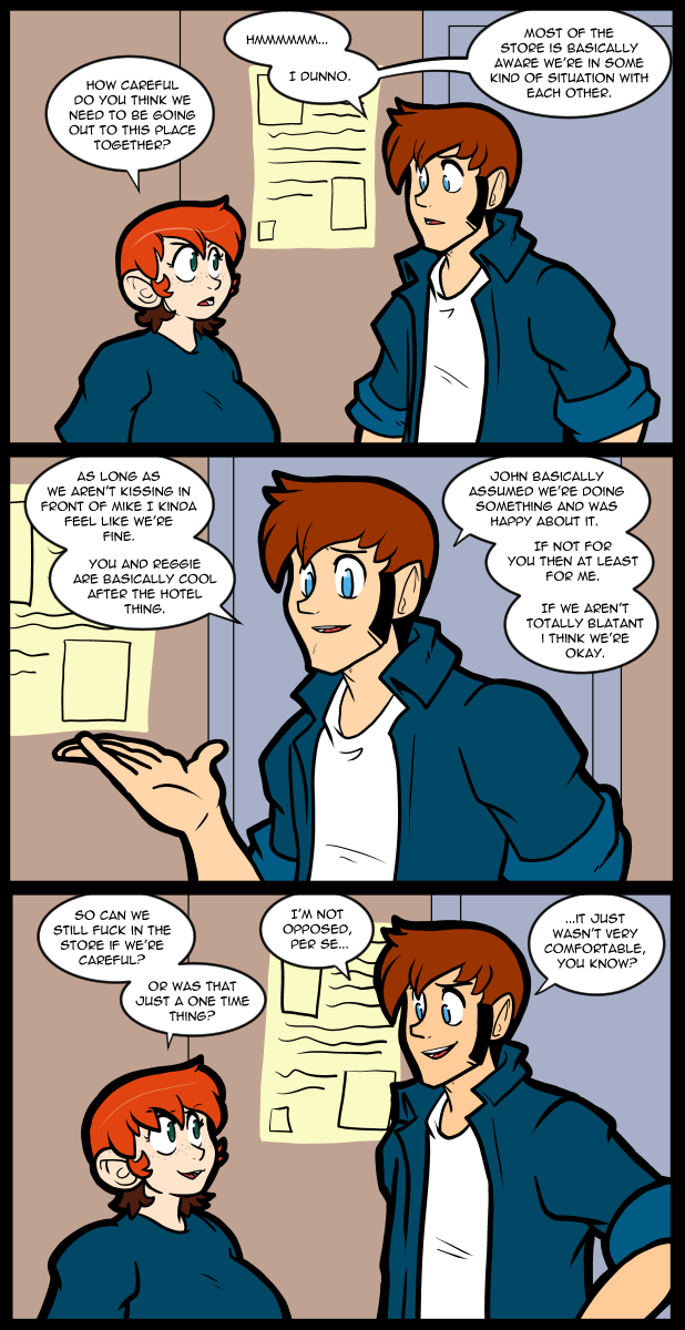
You know the shirt color has every one distracted when no one is mentioning the fact that they had sex at work.
What?! Doesn’t everybody?
There’s not much to say about it, except that I’m surprised Thomas was okay with it. I figured he’d be too anxious.
comic 972 while dart battle was on going mentioned by Thomas in comic 979
Meanwhile…Mac and Tosh, the two gophers from Bug’s Bunny cartoons- mix the colors, [beige] and [gray], and call their new color, “grayj”.
Hm.
Add me to the list of “Never saw a tinge of green in the Megatainment shirt until this arc”.
Also, as a redhead, I have to watch my colors as Carol does. I found that a number of purple shades can be overlooked.
That is one long pinky finger!
The red, red-orange bit triggered an old memory. Back in the ’80s Zenith came out with a crt (picture tube) where the red phosphor had a distinct orange cast to it. The first one I came across I spent some time trying to realign it because I thought the red beam was also illuminating the green phosphor. Red + green = orange. I found this to be very annoying.
FWIW pure blue x0000ff is difficult to see particularly as text characters. Found the out giving presentations. Much better to mix some green in.
Very much enjoy the comic.
I got completely sidetracked by the blue-green disconnect and forgot to post my other thought, but didn’t bother chiming in on it since others had that angle covered pretty thoroughly.
On an unrelated note, I love how earnest Carol looks in the last panel there. We see her smug or stern quite often, but there’s something softer around her eyes here. Funny that it comes out when wording things so crudely, but it’s no less cute for that.
Add me to the list of people that see it as blue. If it was green it would be closer to Carol’s eye colour
How do y’all feel about something between 00606e-00656e matching “blue but noticeably a bit green? I’d call it dark cyan.
From a George Michaels song:
(Singing)-
“I think I’m done with the [bedroom].,
I think I’m done with the hall.
I think I’m done with the kitchen table,…Baby…Let’s go have a BALL.
Let’s take it outside!”